Weather Index - Navigating through the tool - User Instructions
This section describes the use of each tab in the user interface and aims to guide the user through running the model from start to finish. Each tab has its own section and it is suggested you move through each of these in sequence.
0. Introduction
What does it do?
This Introduction tab is included purely as a reference for users and does not affect the app in any other way. The tab gives a brief overview of the tool similar to these help pages.
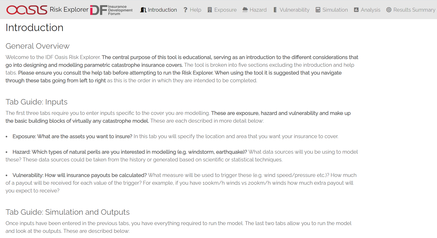
Risk Explorer Introduction Tab
1. Hazard
What does it do?
The hazard tab is where you specify the types of events you wish to model and the data to be used to do this. The perils and data sources you select here will feed into the simulation approach used on later tabs. In this tab you will load an appropriate hazard data set based on the location of your exposure and the peril you wish to model.
User Instructions
The hazard tab is where you specify the nature of the events you are interested in modelling as well as what source you will be using to model these. There are a few input boxes to complete before loading the data. The selectable values in each box will differ depending on the selections you make in the boxes above. Make sure you enter these in the order they are listed on the page. The subsequent steps will guide you through appropriate selections for each of the dropdown boxes pictured in the screenshot below.
Step 1.1: Select the peril you want to model: A peril is a specific type of event. Select Drought.
Step 1.2: Select the hazard data type used to model your chosen peril: Data can be either historical observation data or simulated data developed by catastrophe modelling experts. For drought, the single dataset currently available is the CHIRPS rainfall data.
Note that the content of the later analysis tabs will differ based on your selection here. This is because the approach used to simulate losses differs substantially between each data type.
Step 1.3: Select the specific region you are interested in modelling: Note that the region groupings available differ depending on the peril and hazard data type you select. This is due to different perils having their roots in different natural phenomena and relying on data sources that may approach these groupings slightly differently.
For CHIRPS data, the regions available to select here are defined by common growing and seasonality characteristics to partition the data in manageable chunks.
**Step 1.4: The ‘meteorological agency’ box should be filled with ‘Not Applicable’
Step 1.5: Load the data: Once you are happy with your selections in the drop-downs above, select the “Load Hazard Data” button at the bottom of the page. The application should display a notification when the hazard data has loaded and confirm your selection on the page.
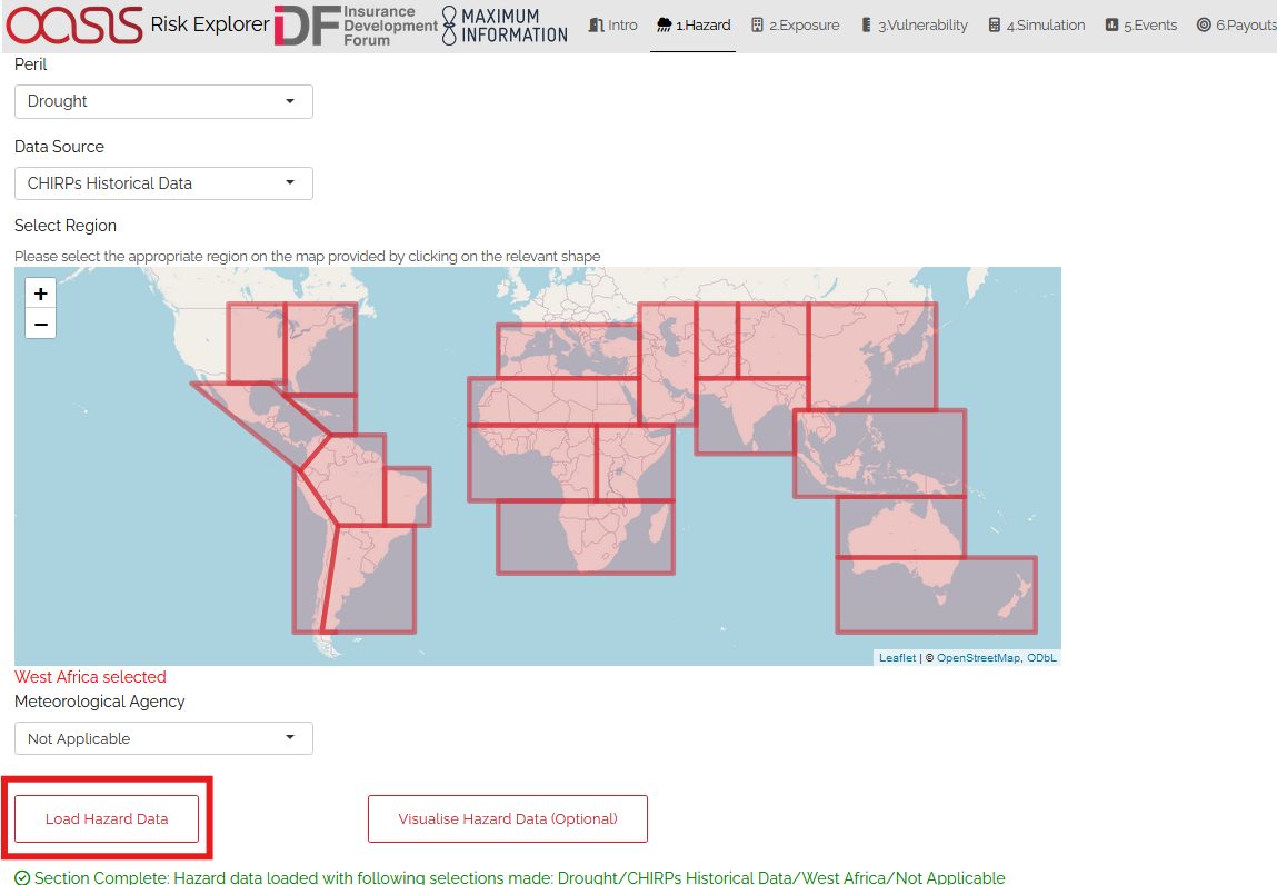
Hazard Step 1: Note the suggested basin displayed below the region dropdown.
Step 2 (Optional): Visualise hazard data: Clicking the “Visualise Hazard Data” button will show an image of the loaded data.
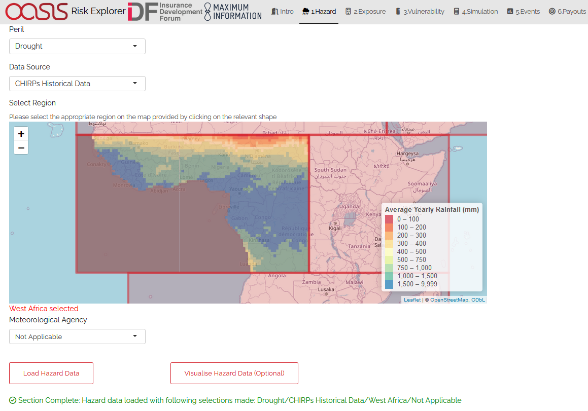
Hazard Step 2
2. Exposure
What does it do?
The exposure tab is where you should specify the area you want to model, and the number and value of policies to be covered - these will be used in the simulation section to calculate potential payouts.
Ensure that area you specify is within the red box displayed. This represents the scope of the hazard data loaded in the previous tab.
User Instructions
Step 1: Enter the latitude/longitude co-ordinates of the location or centre of the area you are interested in covering: There are three different ways you can enter these. The method you choose will depend on the information you have about your location/area.
If you know the latitude and longitude of the location/centre of the area then you can enter this directly: Enter “Yes” to the first question in Step 1. You will then see two input boxes below the map where you can enter your latitudes and longitudes. Once you have entered both of these, the location you have selected will display on the map. Before moving to the next step, ensure the location selected on the map is what you were expecting.
If you know the address of the location/centre of the area then you can search for it directly: Enter “No” to the first question in Step 1. Click the magnifying glass icon displayed in the top-left of the map screen. A text input box will appear where you can search for your address. The address search uses OpenStreetMap with addresses generally displayed in the native language of the country they are located in. Once you have entered your address and selected one of the options from the drop-down, the location you have selected will display on the map. There is a chance your address may not be listed. If this is the case, you may need to enter your location using the third method outlined below.
If you know neither the address or the latitude and longitude: Enter “No” to the first question in Step 1. You should then use the map’s zoom and drag functionality to find the approximate area you think your exposure is located in. Click on the map and the location you have selected will display. Keep clicking on the map and zooming as required until you have selected the location you wish to select.
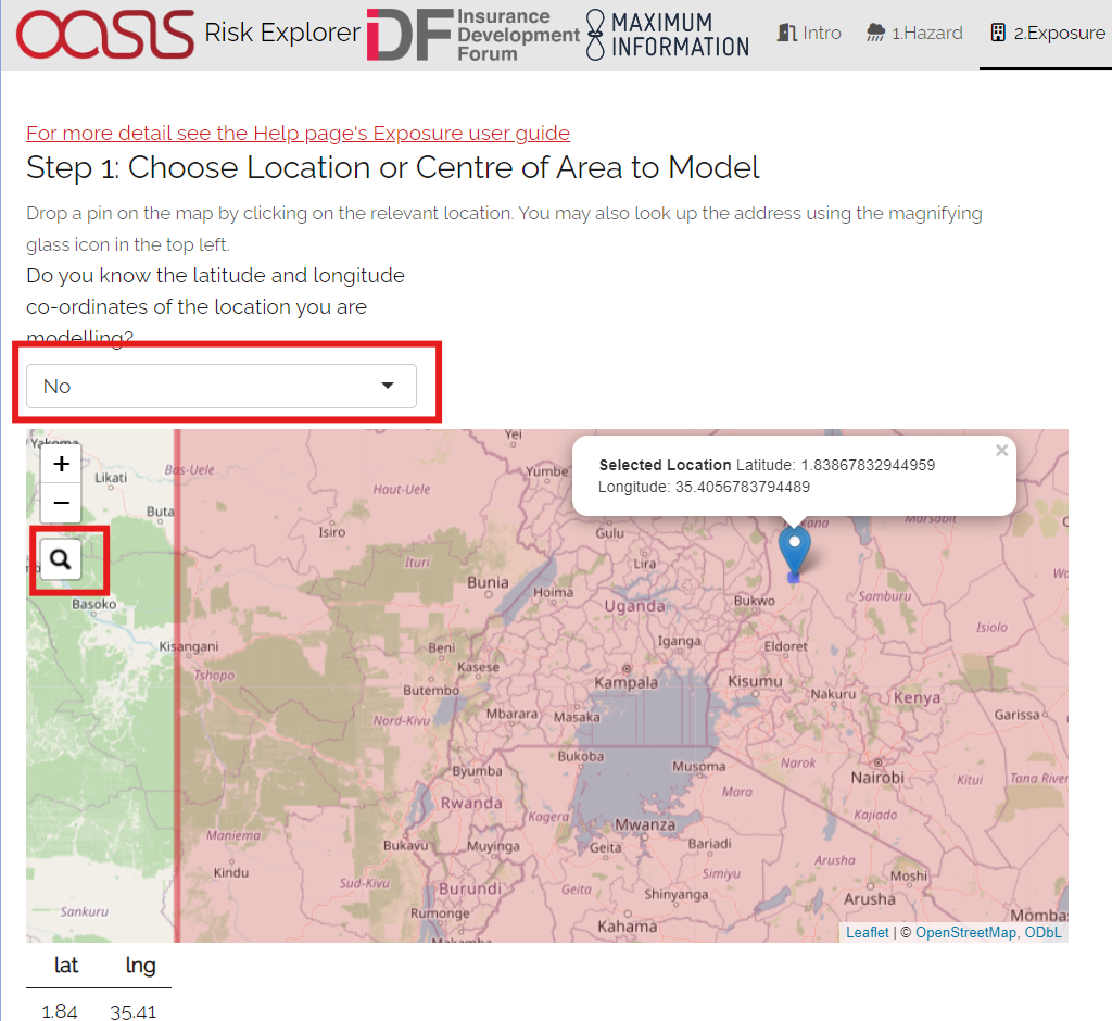
Exposure Step 1
Step 2: Specify the area you want your insurance policy to cover.
Specify the shape length and width that you believe is representative of the area. This will define the total area in which the insurance cover will respond. You can also easily experiment with different radii using the map.
It is suggested that you choose the smallest possible area that captures the area you wish to cover. The reason for this is that any additional area specified is likely to increase the chance of you sustaining losses when the area you are interested in covering isn’t actually impacted by an event. Also if you were looking at purchasing an insurance cover, a greater chance of payouts would mean that the insurance cover would ultimately be more expensive to buy. Note that the tool currently only allows you to specify an area of up to 200km radius. This is to prevent calculation issues.
Step 3: Enter your policy value, number of policies and currency Enter the value of each policy and select an appropriate currency from the list provided. Note that you must enter a policy value greater than zero here. If you were modelling parametric insurance through the tool, you could think of the policy value as the maximum payout to any one policyholder under the cover. The maximum payout of the overall cover would be the total number of policyholders x individual policy value.
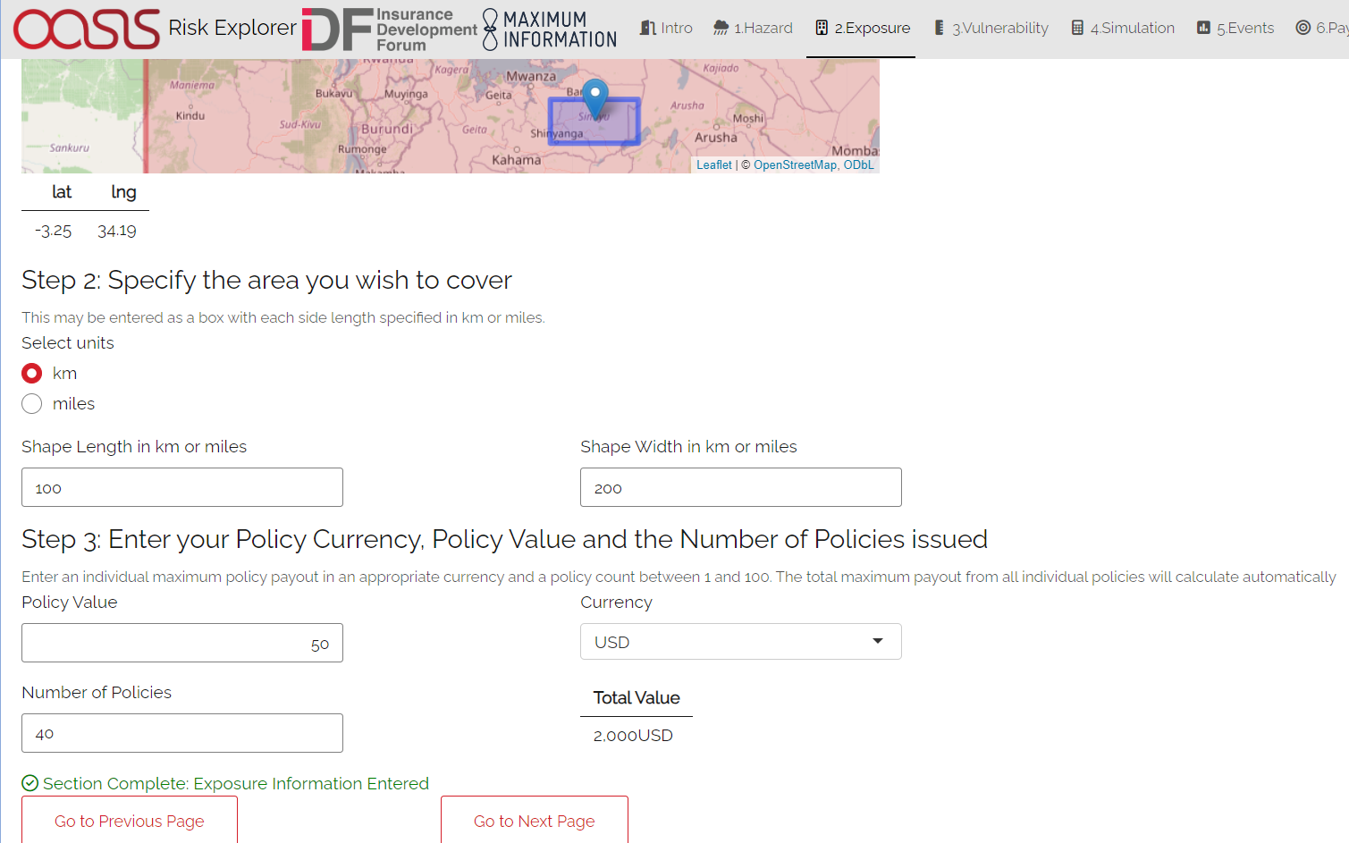
Exposure Step 2 and 3
3. Vulnerability
What does it do?
The vulnerability tab defines how physical events translate into damage/financial loss. You will define this as a relationship between your intensity measure (e.g., wind speed) and a damage percentage. This is done by specifying the main input on this tab which is the vulnerability curve. This curve will assign a given damage percentage to each value of the intensity measure. In the Risk Explorer, damage is measured as a percentage of the total asset value. It is assumed this directly corresponds to the financial cost of repairing any damage. The shape of your curve will vary based on what you know about your exposure and what you’re using the model for.
Note that although there is currently no explicit tab in the model for structuring insurance, the vulnerability and the insurance structure are essentially the same thing for parametric insurance covers. The financial loss is solely defined by your trigger measure and payouts which are essentially equivalent to the intensity measure and damage percentages in the vulnerability tab. As such, you can also allow for simple parametric structures through this tab, however the terminology used throughout would differ slightly (e.g., rather than asset value, you would be talking about maximum insured). See the What is parametric insurance? for more detail on parametric insurance.
User Instructions
Step 1: Specify the intensity measure. The intensity measure is a hazard intensity parameter that should be closely related to the likely damage caused by an event. For drought two measures are available: Percentage of Climatology and Number of Dry Days. Once you have selected your intensity measure, you then choose which units to specify it in.
Percentage of Climatology: A measurement of the precipitation anomaly, i.e. the relativity between the rainfall recorded for a given period and the average over a representative multi-year average (the climatology). A reading of 100% represents completely average rainfall over the period during a user-defined season, below 100% is drier than average and above 100% is wetter than average. The difference is expressed in terms of ‘% climatology’, where the climatology is the long-term (1984-2020) mean of rainfall for the user-defined season in question
Dry Days Index: An index representing the consecutive number of ‘dry’ days of length greater than or equal to a pre-defined threshold. What constitutes dry here is defined as a user inputted % of seasonal climatology (see definiton above). All dry-spell index calculations are based off 5 day periods or ‘pentads’. Calculations are based on each individual 5-day period, so ‘10 dry days’ here actually represents two consecutive five-day periods where the total rainfall was below the given threshold.
**Step 2: Select an appropriate growing season and qualifying dry spell (if relevant). This sliding date scale is populated automatically with appropriate dates for the hazard region selected. However, users can adjust this scale manually. Note that for a dry spell index trigger, two additional considerations apply, denoted by the box in blue below. The user must specify what counts as “dry”” (in terms of a percentage of climatology), as well as the period over which this needs to be recorded. The user must specify what counts as a “qualifying” dry spell, only dry spells of that length or greater will erode any triggers in the vulnerability section below. E.g., if there is a 20% payout for a dry spell index of 40 days total and the qualifying period is a 15 day dry spell, two 20 day dry spells would generate a payout, but a 10 day and a 30 day dry spell would not (the 10 day spell would not be counted as it is less than 15 days, so your toal dry spell index for that season would only be 30 days)
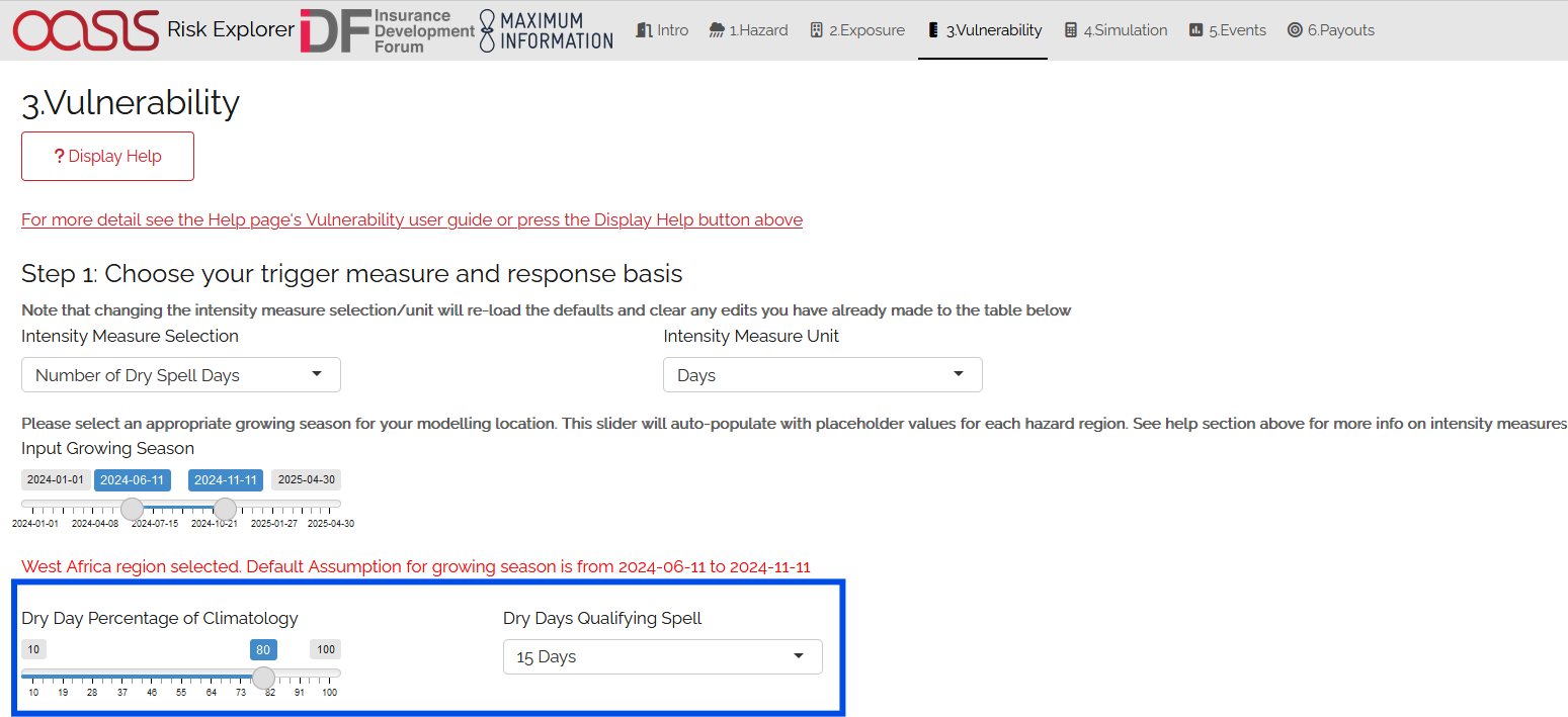
Vulnerability Tab: Steps 1 and 2
Step 3: Choose your vulnerability curve type. The curve type you enter determines how the damage percentages you enter change as the intensity measure increases/decreases. You can choose from a stepped or linear vulnerability curve. It is worth trying both options and consulting the graph below to see how this works in practice.
Step: This curve replicates how most parametric covers work. The damage generated increases in “steps” corresponding to the highest specified intensity measure exceeded. For example, with the default values below, it would be assumed that you would sustain damage amounting to 100% of the policy value if 80% of normal rainfall was to occur.
Linear: This curve is closer to the approach used in catastrophe modelling, where a more detailed approach is used to specify the damage generated at each value of the intensity measure. The damage generated increases linearly for the values you enter in the grid. For example, with the default values below, it would be assumed that you would sustain damage amounting to 100% of the policy value if 80% of normal rainfall was to occur.
The curve you select is likely to differ based on the aim of your modelling. If you are trying to replicate parametric insurance payouts, the stepped curve is likely the more suitable option. By contrast, if you are trying to closely model likely damage to the underlying asset, the linear curve may be a more appropriate selection. The graphs below show what each curve type looks like with default values for intensity and damage.
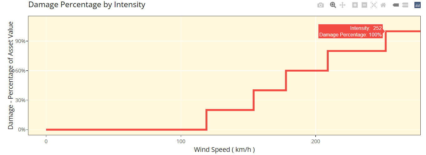
Vulnerability Tab Step 2: Stepped Curve
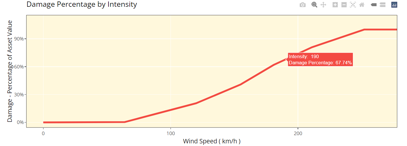
Vulnerability Tab Step 2: Linear Curve
Step 4: Enter your damage percentage at each level of intensity
Together with step 2, the values you enter here will determine the overall shape of your vulnerability curve. The columns for intensity and damage percentage highlighted in red in the table below are editable by double-clicking on the table. After making your edits, press Ctrl + Enter to save these and exit the table’s edit mode. Note that the damage percentage must be entered as a decimal so 40% of the maximum amount would be entered as 0.4.
You may want to edit the damage percentages to reflect what you know about the cost of previous events for your area of exposure. The graph at the bottom will also update based on the values you enter in the table. This should act as a visual aid to see what damage would occur for each value of the intensity measure/trigger measure.
Notes for specifying points on your vulnerability curve: * Note that you do not need to use all six rows if you do not want to and can leave any extra rows at the bottom blank. You need to enter a minimum of one row for a stepped curve and a minimum of two rows for a linear curve.
No individual rows should have a damage percentage exceeding 100%, as an asset being more than fully destroyed in an event doesn’t make logical sense.
If you are still unsure what to enter for any of these fields, you can just use the default values given in the tool.
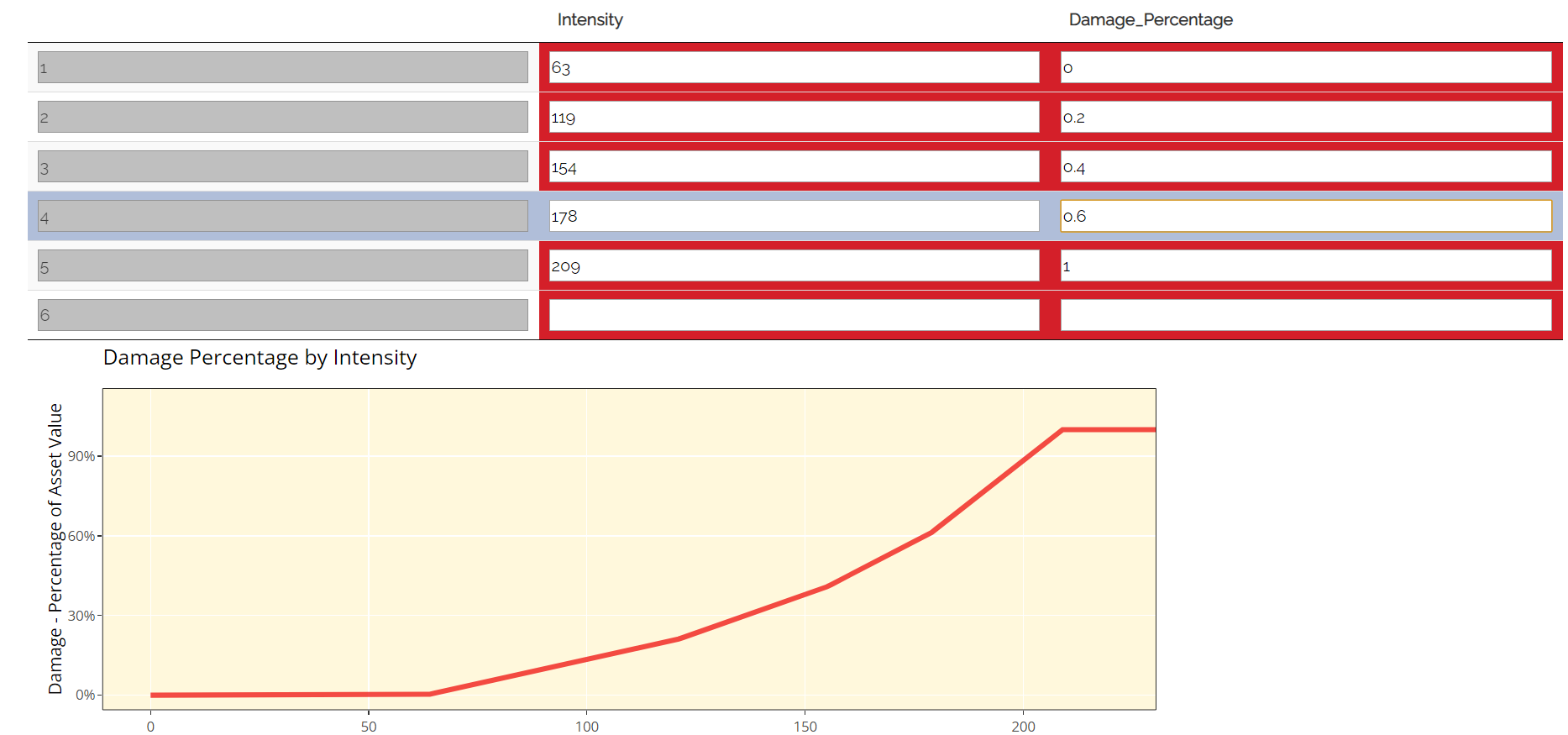
Vulnerability Tab: Step 3
4. Simulation
What does it do?
The simulation tab is where you run the simulation modelling that feeds the app’s main outputs. The simulation engine is based on a simple and transparent methodology.
The background calculations going on in this tab are a lot more involved than the other sections, as such a more detailed description of the simulation method can be found in the Tropical Cyclone - How does the Simulation Methodology Work? section. A brief and relatively non-technical description is given below for each type of hazard data, however you will need to look at the more detailed explanation to fully grasp the method and its applications.
CHIRPS Data
Step 1: Subset CHIRPs data for exposure area and calculate intensity metric values. The CHIRPs dataset used contains high-resolution prcepitation readings across 5-day time periods for many years at a fine resolution. This makes it a large dataset. The first step is to subset the data for the area we are interested in and calculate the relevant intensity values for any potential location in the exposure area for each year during the growing season specified
Step 2: Simulate individual policyholders at random locations within the exposure area. Allocate the number of policyholders specified in the exposure tab to random locations within the exposure for each simulation. This introduces additional variability and in practice these types of schemes will likely not know exactly where policyholders are located.
Step 3: Calculate the payouts for each simulated location and historical year. Examine the intensity metric and vulnerability curve at each simulation location and use this to derive a payout for each simulation-historic year. This gives a complete simulated history for each location.
Step 4: Average across all simulated locations and historic years to calculate expected payout and standard deviation. Other calculations will also be performed at this stage to feed the Events and Payouts tabs.
User Instructions
Only run simulations once the exposure, hazard and vulnerability sections are complete as indicated by the checklist. Once you are happy with your inputs, you can specify the number of simulations you wish to run before clicking “Run Simulation”. Note that in some cases, the application may flash up a warning instructing you to re-enter an input if there are issues with the selections you have made in the other sections.
The more simulations you run, the more stable/reliable your output will be, however a higher number of simulations will take longer to run.
There is a smaller number of total simulations selectable (25-100) for drought as convergence is generally achieved more rapidly than for tropical cyclone. This is largely attributable to a high degree of spatial correlation within the hazard over a given historical year. A loading bar will appear during the simulation run and a notification will display once the results are ready to view. Note that this tab may take anywhere between 20 seconds and 3 minutes to run. The time taken to run will heavily depend on:
The number of simulations you choose.
The size of the area selected in the exposure tab. Larger areas will take longer to run as each individual simulation will contain more events.
The region you have selected in the hazard section. Some areas are more active or contain more years of data than others.
The number of policyholders. More policyholders require
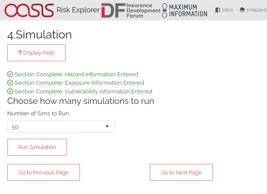
Simulation Tab
5. Event Analysis
What does it do? The event analysis tab is where detailed exhibits summarising the events in the simulation modelling can be viewed. These tables and maps aim to give the user a clear summary of the types of events generated by the model, how severe they are, and how likely they are to occur. This section also aims to give more context on what a simulation is and what the method is doing in the background. Each exhibit attempts to address different learning outcomes:
Exhibit 1: Historical Years Payout Summary Which years of historical observational data would have led to payouts in your area of exposure, and what was the range of uncertainty around them introduced by the simulation process.
Exhibit 2: Individual Simulation Summary What does an individual simulation actually look like? How does each simulation vary?
Exhibit 3: Event Frequency and Return Periods How often do different levels of total payout occur?
These are all covered in more detail below. There are also further exhibits more focused on the losses generated by the model on the Loss Analysis tab. Note that output will only display on this page once simulations have been run.
User Instructions
Display
Note that output will only display on this page once simulations have been run. The “Display Options” section at the top of the page gives you the choice of displaying payout metrics as actual currency amounts or the number of policyholders impacted, to get a better idea of how many communities receive payouts under the cover. A policyholder is considered “impacted” if they receive any payout. This is not scaled, so under this metric, a policyholder receiving a 20% payout is reflected in the same way as someone receiving a 100% payout.

Events Analysis Tab: Display
Exhibit 1: Historical Loss Summary This plot displays the distribution of total payouts to all policyholders across all calendar years and simulations. This plot should give you an idea of how the payouts would have varied for any given year depending on different geographical distributions of policyholders. CHIRPs data loaded into the app ranges from 1983-2019, so you will see payout distributions across all these years
The red dot represents the average total payout to all policyholders for a given calendar year’s rainfall. The light grey line shows the full range of simulated values across a given year (i.e. the lowest and highest payouts across all simulations for a calendar year). The black line shows the range within which the 50% of simulations closest to the average fall. There is also a table below containing the same information.
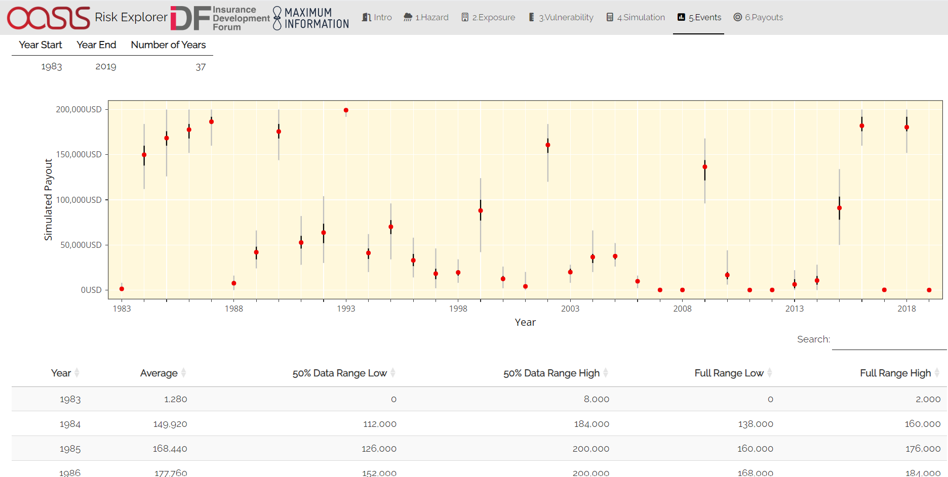
Event Analysis Tab: Exhibit 1
Exhibit 2: Individual Simulation Summary
Exhibit 2 allows you to look at the results of any individual simulation by selecting the relevant simulation number and year. The table immediately below gives a summary of the main outputs of the simulation. The map and corresponding table display the events in the event set that would have led to payouts in each individual simulation. The main purpose of this exhibit is to give more transparency on the simulation method and how we arrive at the simulated payout figures in the Payouts tab. The figures displayed here for each simulation should match what is in the exportable csv files on the Payouts tab.
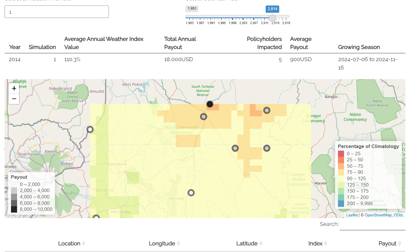
Event Analysis Tab: Exhibit 2
Exhibit 3: Event Frequency and Return Periods
Exhibit 3 gives an estimate of how often different total payouts occur in the history and in the simulation output:
Return Period refers to the average time you would have to wait before observing a payout of a given amount or more, e.g a return period of 5 years for a cat 2 storm means you would expect to have one storm at cat 2 or above every 5 years on average. Bear in mind these represent averages, and it is possible to have two 100-year events occur in subsequent years. Another way to think about return periods is the probability of occurrence in any given year. A 10-year return period means there is a 1 in 10 (10%) chance of an event happening in any given year.
This exhibit can be useful for examining how often you might expect different total payouts under the scheme according to the simulation approach.
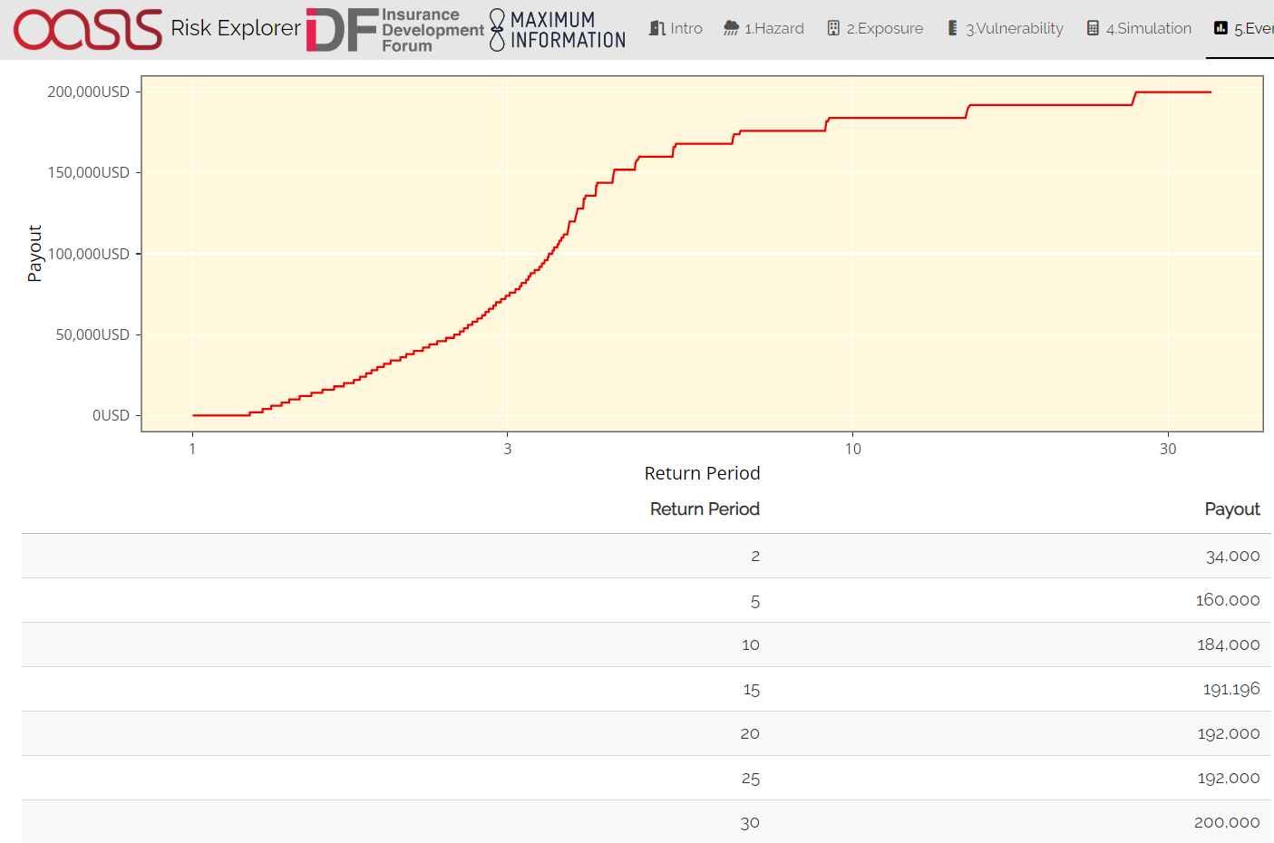
Event Analysis Tab: Exhibit 3
6. Payouts
This tab analyses the payouts generated in your modelling. It will also show you the full range of simulated payouts and other metrics that will help you better understand the risk. This tab also allows you to export modelling results into Microsoft Excel should you wish to do further analysis. There are three main outputs on this tab:
Exhibit 4: Loss Frequency Summary How often should individual policyholders expect to receive different annual payout<g_payout_reference-label> amounts in any given year?
Exhibit 5:Expected Payout and Distribution What is the expected payout for the whole cover in any given year and how does this vary across simulations? This exhibit shows the distribution of different total payout amounts across each simulation as well as the expected payout for the cover overall
Raw Model Output: These are downloadable csv files containing the model output at different levels of granularity. These can be used to perform supplementary analysis or just to gain a better idea of the calculations underpinning the model. These files would also be a useful aid when reviewing the Tropical Cyclone - How does the Simulation Methodology Work? page in the FAQs.
User Instructions
Exhibit 4: Loss Frequency Summary
Exhibit 4 shows the frequency of different annual payout values or ranges in the simulation output. This exhibit should enable you to get an idea of the chances of seeing different payout values for a given policyholder in any given year (e.g., if the red bar shows 90% for a zero payout, then 90% of the time the policyholder will not get a payout). The exhibit displays individual payout values where a step vulnerability function has been entered, and loss ranges where a linear function has been used. Where ranges are displayed, these include the higher amount and exclude the lower amount e.g., USD 0-20,000 would exclude losses of zero but include losses of USD 20,000 The table also displays the percentile and the total count of simulated instances that resulted in a given payout. Payouts shown here are cumulative throughout the year and capped at the total policy value. E.g., if you had a 60% payout and a further 80% payout in a given year, this would appear as 100% in the chart.
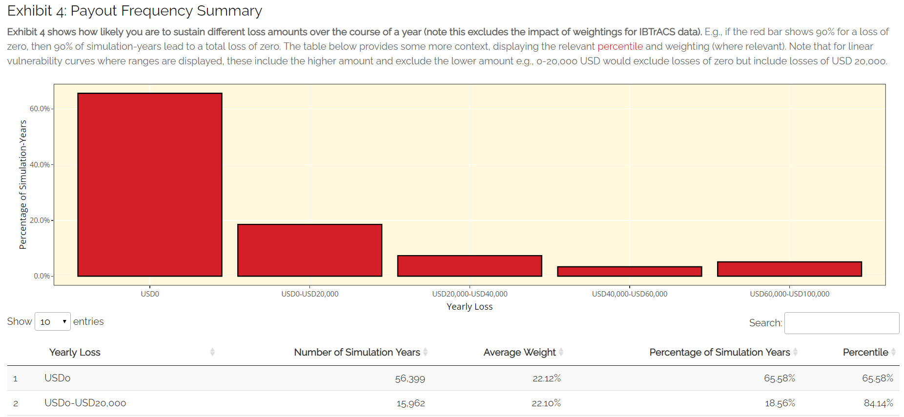
Loss Analysis Tab: Exhibit 4
Expected Loss and Distribution by Calculation Method
This exhibit shows estimates of the expected payout under different calculation methods as well as the full distribution of the simulation output. The distribution shown on the graph by the solid red line orders the simulations from the highest to lowest loss, so you can see the range of outcomes you might expect across the simulated history. The x-axis gives the loss rank of the simulation in the overall output (e.g. rank 300 of 500 simulations is the simulation that generated the 300th highest average loss). The expected payout under the simulation method is also displayed by horizontal line on the graph.
The Simulation Payout represents the average annual payout across all simulations and policyholders. The table also shows the standard deviations which give an estimate of the variability of the payout. The higher the standard deviation, the more variability there is in payouts across simulations. This variability is often equated with uncertainty and is one of the additional factors considered when structuring and pricing insurance contracts.
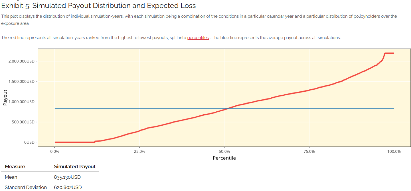
Loss Analysis Tab: Exhibit 5
Export Results to Excel
Raw model outputs can be downloaded as CSVs, two such files are available for drought at different levels of granularity. One gives summary output for the whole cover for each simulation-year (i.e. sums across all location/policyholders’ payouts), the other gives individual payouts for each location/policyholder.
Download summary output for each simulation: Each row in this file represents the payouts for all locations/policyholders for an individual Simulation-Year.
Unmarked first column: Row identifier
Sim: Simulation number. Each value represents a different set of simulated policyholder locations
Year: Historical years’ rainfall data used to calculate payouts for simulated locations in question. The underlying data is taken from the CHIRPs dataset
Payout: The total payout calculated for the Simulation-Year in question based on the terms entered in the vulnerability section
Policyholders Impacted: The total number of locations for which a payout greater than zero is generated for a Simulation-Year
Download detailed output for each simulation: Each row in this file represents the payout for a given location/policyholder for an individual Simulation-Year.
Unmarked first column: Row identifier.
Sim: Simulation number. Each value represents a different set of simulated policyholder locations
Year: Historical years’ rainfall data used to calculate payouts for simulated locations in question. The underlying data is taken from the CHIRPs dataset
Location: identifier for a given location in a given simulation, the maximum number here should correspond to the total number of policyholders entered on the exposure tab
Longitude: Simulated longitude for the given location in a given simulation
Latitude: Simulated latitude for the given location in a given simulation
Index: The drought index value calculated at the given location for a given historical year’s conditions. This will differ depending on whether percentage of climatology or dry spell days has been selected.
Payout: The total payout calculated for the Simulation-Year in question based on the terms entered in the vulnerability section
Policyholders Impacted: A binary variable that will show a 1 where any payout was generated and a 0 otherwise.
Loss Analysis Tab: Export Results